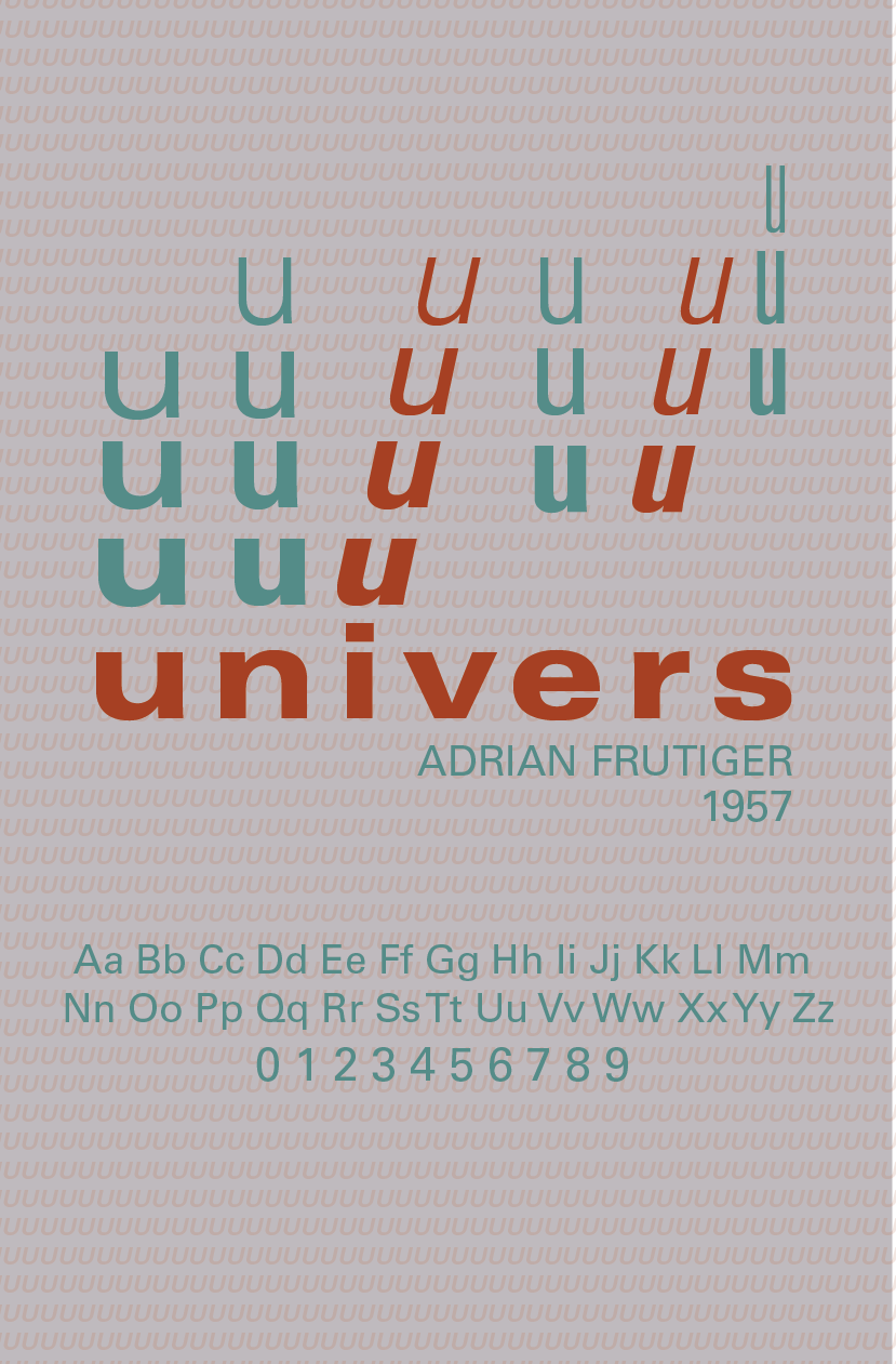
univers typeface poster
overview
what
Poster made for my graphic design class meant to showcase a specific typeface. I chose to work with Univers.
tools used
Adobe Illustrator, paper
how it all went down
For this assignment, I decided to go with Univers, a modern san-serif by Adrian Frutiger. While researching the typeface, I found out that the type family contains 21 different widths and weights, making it a larger-than-average type family. That was something I wanted to incorporate in my poster, which is why I chose to repeat the name Univers multiple times in different weights. As for color choices, I took inspiration from Swiss style posters I saw online, with red being the most common. I tried to give the poster a Swiss style look because Univers and other similar neo-grotesque typefaces are often used in Swiss style. Another element from Swiss style that I incorporated in my poster was the use of grids in placing each element.
process
I tried many iterations, using several different poster layouts and color combinations, until finding my favorite one. My color palettes were from Swiss Style Color Picker , which helped me use dynamic colors to catch the eyes of those who pass by. My most successful layout ended up being the middle one on the bottom row, because of the contrast of big and little, as well as the color choices and type widths.


